

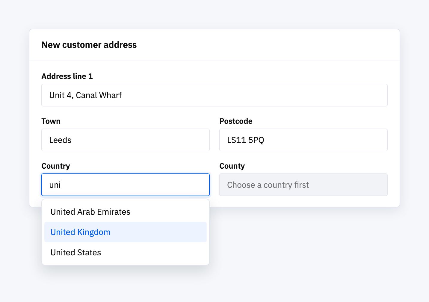
The request was small. On the invoice search screen of a system we look after, staff could filter by spending category, but only by typing the category’s name into a blank box. Nothing showed which categories existed. If you didn’t remember the exact wording, the filter was little help.
We replaced the blank box with a field you type into that shows the matching categories as you go, and put it on the three screens that had the same filter. Staff could now find a category without knowing its exact name.
That raised the obvious next question. If one field was this awkward, how many others were?
169 dropdowns, and no idea which ones hurt
Every place a user picks one thing from a list used the same plain dropdown. The easiest way to get a number was to count, so we did: 169 dropdowns across the system.
Most of them are fine as they are. A dropdown with “Yes” and “No” in it, or five order statuses, doesn’t get better when you can type into it. Some lists clearly had outgrown the plain version, though. The country list has around 194 entries. Pick the UK and the county list has around 100. The business type list in our sample data had 103, and job titles had 61. On lists that long, a plain dropdown means scrolling, or typing the first letter and hoping.
Why we didn’t convert all of them
Once you have a better component, it’s tempting to swap it in everywhere in one go. It’s a quick change in each place, and the system would end up looking consistent.
We didn’t, for two reasons. First, about three quarters of those dropdowns would gain nothing, and every change carries some risk of breaking a screen people rely on. Second, a few of the long lists already had their own search built in. Nine pickers either fetched results from a live search or showed a search box that brought back the top 30 matches. Putting a type-to-filter field on top of those would have given people two searches on one screen. Worse, filtering only the 30 results already loaded could hide a record that existed but sat outside that first batch. A user would see nothing and assume the customer wasn’t there.
So we wrote down every one of the 169 and gave each a verdict before changing anything.
The audit, and what it found
Counting 169 dropdowns by hand, then tracing where each one’s options come from, sounds like the kind of job that never gets done. We did it anyway: for every dropdown we worked out where its options came from and how long the list could get, and put each one in a group:
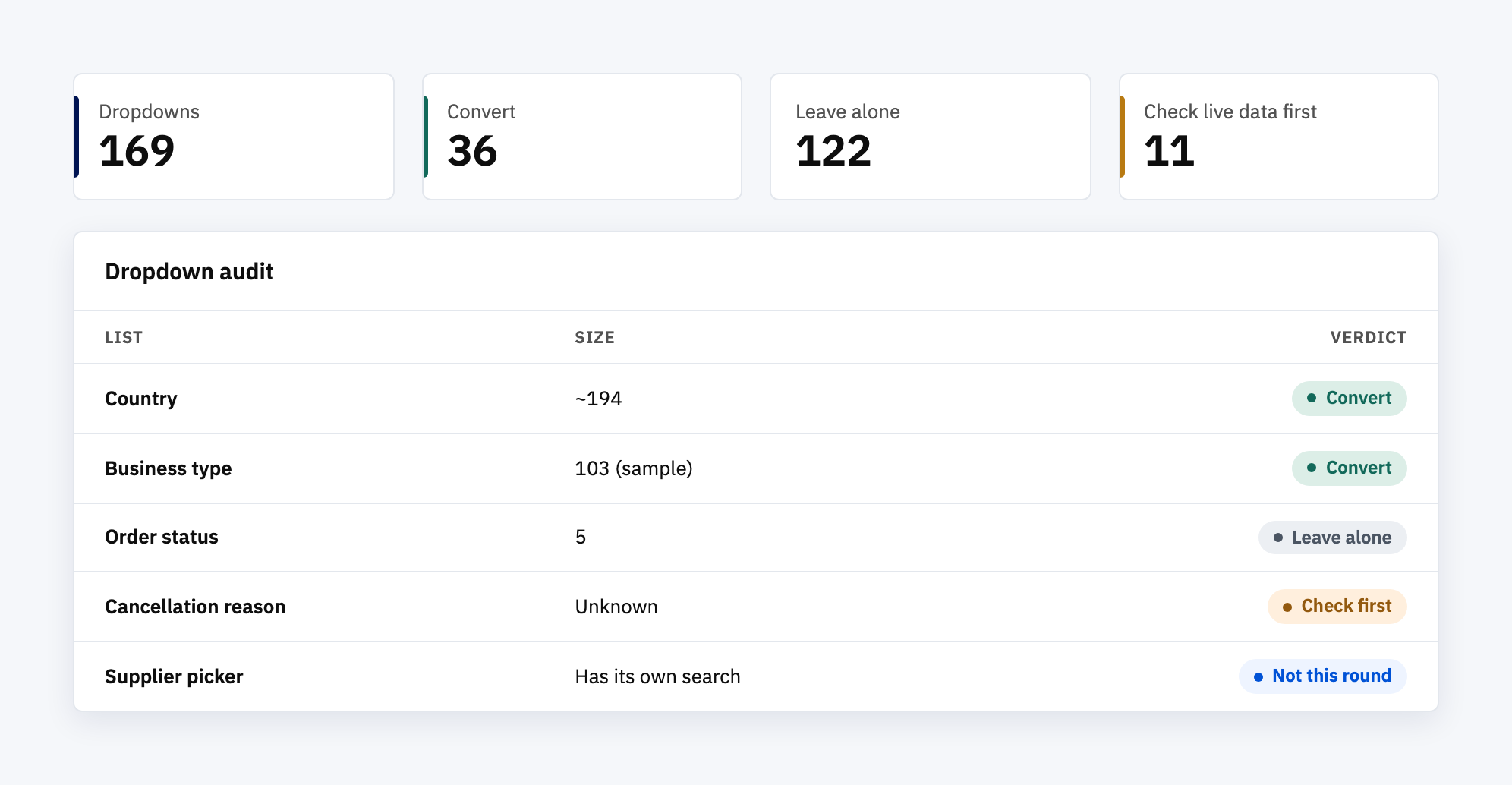
- Good candidates: 36. Long or ever-growing lists with no search of their own, like countries, counties, job titles, business types, tags and staff names.
- Leave alone: 122. Short, fixed lists where typing adds nothing.
- Check first: 11. Lists such as cancellation reasons, where our sample data couldn’t tell us how long the real list had become. Those wait until someone checks the live numbers.
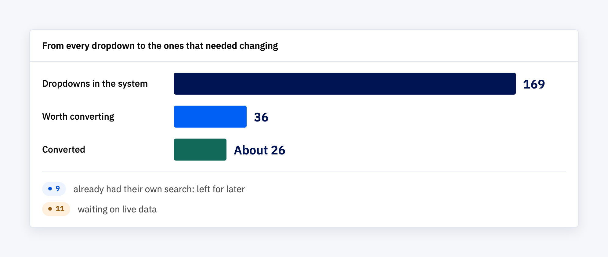
That first sort wasn’t the final answer. Two of the 36 were already marked as poor fits. When we went back through the rest screen by screen, seven more turned out to be pickers with their own search box, which takes us to the nine above. That left about 26 that could switch over without changing anything else on the screen.
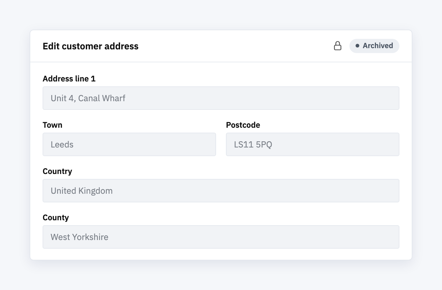
The same check turned up a bug in the new field itself, which the audit hadn’t spotted. Some records are locked once they’re finished, such as an archived customer’s address or a supplier application that has been processed. The old dropdown respected the lock. The new field showed the locked value correctly, but its small clear button still worked, so you could wipe a field that was supposed to be read-only. Three of the screens on the list would have hit this. We fixed the component first, then made the swaps.
Choosing by count, not by feel
None of these changes would make a headline. They’re the kind of improvement that tends to get done in one of two ways: everywhere at once, because the new thing is better, or wherever someone last complained.
Counting first avoided both. It kept the change to the places where it helps. It found the nine screens where the obvious fix would have caused new problems, and the locked-record bug, before any user did. And the 11 lists in the “check first” group are now a short, specific question for later, rather than a guess made today.
Small changes still need a list
We don’t have figures for how much quicker the new fields are. Nobody timed it, and we’d rather say that than guess. What we can say is that the long lists without a search of their own now all work the same way, the short ones were left alone on purpose, and each choice can be traced to a line in the audit.
A small change made everywhere can still cause problems. Working out where it belongs first doesn’t take long, and it doesn’t break anything.
Ready to fix the small things properly?
Most systems collect small annoyances over the years: a filter nobody can use, a list that’s too long, a field that should be locked and isn’t. They’re cheap to fix one at a time. They’re cheaper still when someone looks at all of them together first and decides which ones are worth it. If your system has a list of these, book a discovery call and we’ll go through it with you.